
Do you ever find yourself frustrated with Excel when creating spreadsheets? Do you wish you could customize data more quickly and efficiently? Our resident (self-proclaimed) Excel Nerd covers several simple ways to make your reports more exciting and impressive.
Note: I use Excel for Mac in the following examples
Here at Adept, I’m kinda known as the Excel Nerd. To put it into context, I can’t use a spreadsheet that isn’t formatted at least a little bit, I de-stress by creating charts, and I met my current boyfriend when he made an Excel joke to me. Yes, I’m that girl, and I’m not ashamed.
I’ve learned over time that creating Excel documents that go from drab to high quality presentation material can make your boss(es) pretty excited as well. Your data and analysis is good, but without formatting, you risk someone not wanting to look at a boring spreadsheet or hiding the data in a chart that doesn’t convey the story. Here I want to go over a few high-level best practices to take your spreadsheets to the next level.
General Spreadsheets
Use these rules in everyday spreadsheet creation for a simple way to make your content look more refined.
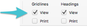
Remove Gridlines
Please, for the love of Microsoft, always remove gridlines. You can wait until the very last step if you like using them as you work, just make sure you remove them before the final version of the spreadsheet. It’s as easy to implement as unchecking a box!
Color Scheme & Fonts
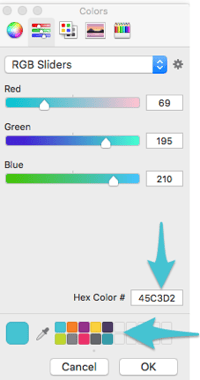
Adept has done a great job with creating Keynote templates for all presentations. We now have best practices and pre-made templates to pull from with correct branded colors and fonts. Why not do this for Excel too?
You can save custom colors in your version of Excel and switch out the font as needed. Be sure to include your logo for deliverables. Once you’ve created a branded document, you can save it as a template, and you will undoubtedly save time in the future by reusing that for your work.

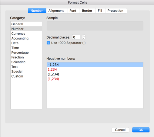
Number & Text Formatting
There are a lot of different ways you can format the actual contents of the cell. You can use one of the default Excel options, or customize to your heart’s desire. Always pay attention to this formatting—otherwise your data may come across as sloppy. You may even end up making a major faux pas by showing a percentage as a decimal.
Here are a few of the formatting options I deal with constantly, and the rules I follow for each:
- Percentages – Include as many decimals as needed; no more, no less.
- Numbers – Set to have “,” break up a large number or have up to a specific number of decimals if needed.
- Dates – There are a variety of ways to display a date. You can have month/year, or month/day/year, etc. When showing yearly by month, I set it to show month/year. When showing specific monthly data points, I include the date. It’s all about how granular you need to get for the specific data.
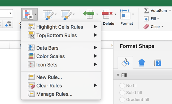
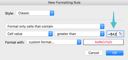
Conditional Formatting
This could easily have its own blog post, so I’ll keep it at a very high level. Conditional formatting is the ability to create custom formatting based on rules you provide. Here’s a good guide to all of the conditional formatting options available to you. The screenshots are a bit outdated, but it goes through scenarios where you would use conditional formatting.
I’m a big fan of Googling Excel help on the fly. You don’t need to memorize all the functions, but you do need to know when you should utilize conditional formatting to help tell your story.
Here are some examples of when conditional formatting should be used:
- To highlight bad/good data in a list
- To highlight changes in growth or percentages
- To show icons or data bars in cells
- To highlight a list of data with a certain term within it
- To assign color to cells based on comparison values or formula
- To highlight highest/lowest/median data points
- To find duplicate values and outliers
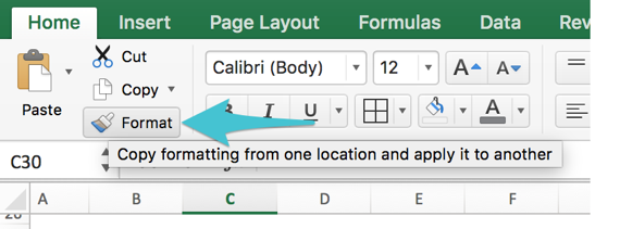
Copy Formatting
You’ve spent so much time setting up a cell for the correct formatting, so don’t waste time doing that all over again. Highlight your formatted cell, click on the paint tool, and copy the formatting to the next desired cell.
Note—are you thinking of using conditional formatting on a list of cells with formulas? Make sure you don’t lock the original data down if using a function comparing the data to another cell. Always unlock the row number so the function can be dragged down.
Borders
I have a thing against bold borders. I don’t like them. I think they are too harsh and can take away from the data. I generally use a much lighter grey than the default black. To each their own, but keep in mind you can change the color to work better with your spreadsheet scheme.
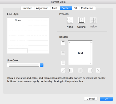
My general rule is to not create borders until the very end. I finally started doing this after I had to remove and redo borders multiple times due to other factors.
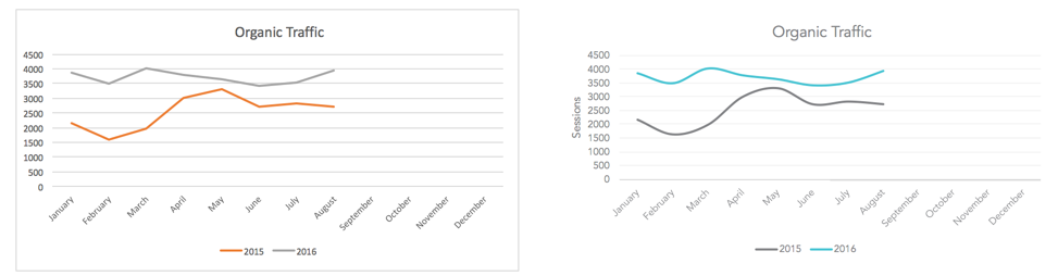
Charts
The topic of charts could have its own blog series on implementation, type, and customization. I’m only going to cover the high level formatting rules for after you’ve created your chart here.
- Remove the border
- Change the fonts
- Change colors to match theme
- Add a title
- Add axis titles
- Lighten the internal chart lines (if applicable)
- Adjust the axis (if applicable)
- Add data labels (if applicable)
- Smooth lines (if applicable)
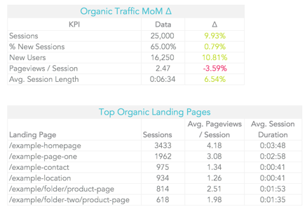
Following these steps can take a chart from generic to something you actually are excited to show, like the charts below.
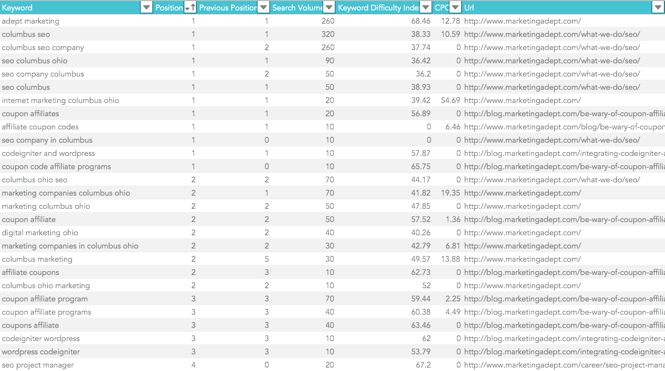
Tables
Tables may be one of the most well-known Excel formats. Putting data into a table keeps it organized and easy to work with. This should be one of the first steps you take if you are working with a data set that fits in a table. Filtering, sorting, and formulas become much easier. These are perfect for reorganizing data to tell a story or analyze.
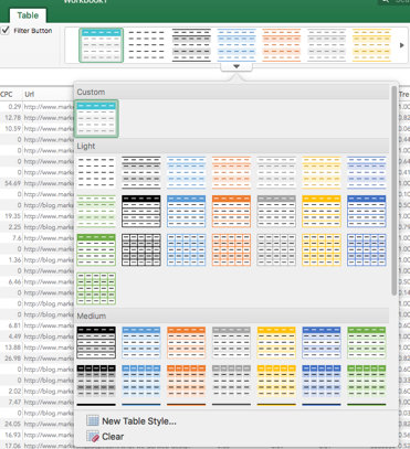
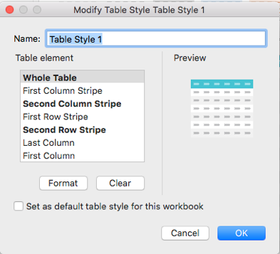
Some of the same rules for formatting apply here – use your branded colors, font, and fix the borders as you see fit. To set up a custom table format to default to, click on the table > go to the table tab > click down on the table designs, and either select new table style or modify an existing one.
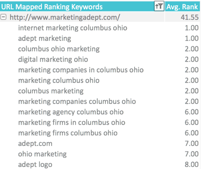
Pivot tables should be mentioned as well. These tables are interactive and summarize data following specific rules. You can customize the formatting for these as well. Go to design > select the drop down for the design > create new pivot table style or modify existing.
Advanced Report Creation
Use these functions when creating those high quality presentation materials I mentioned earlier—like spreadsheet reports or deliverables.
Complete Spreadsheet Customization
Have you ever been working on a spreadsheet and had trouble getting the widths to line up correctly in a column, and it drives you nuts? Change every cell width to the same size and use merge cells for full customization.
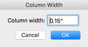
This will take more time in the set up process, but it is absolutely worth it if the report is an important document or will be reused. Look at the difference below.
 VS.
VS. 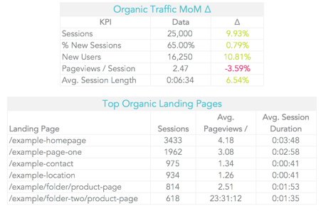
Data Organization
It’s important to stay organized when you are creating a complex spreadsheet. I always have a tab for raw data. This can be pulled from APIs using plugins or exports from data sources like Google Analytics or SEMrush. I create another tab for calculations, where I pull over the data and do all the analysis there. This keeps my raw data clean and gives me a place to play around with how I present the data. The calculations tab can get pretty ugly, so ensure you keep it organized if you need to revisit.
Create another tab for the final data presentation. This tab takes what I created in the calculations tab and shows the final charts and tables. Don’t data dump, though. Include only the data needed for the main takeaways. Create an executive summary section to explain the data to someone at a concise and high level.
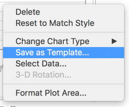
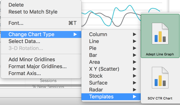
Chart Templates
Once you have created a chart that is formatted perfectly, why should you have to spend more time recreating that chart over and over? You shouldn’t. Turn the chart into a template. You may have to tweak the chart a bit based on the data, but you won’t have to deal with some of the annoying items over and over, like changing font or removing the outline.
Create a PDF
In the end, you’ll have a spreadsheet that makes coworkers swoon. But, do you just want to send an Excel sheet? Sure, if someone needs to look at the numbers and work off of it. But, sometimes a spreadsheet can get screwed up in the process. So if you are sending to a client or c-suite level person, you’ll want to turn your spreadsheet into a PDF following these simple steps:
- Highlight the area you want to include in the PDF.
- Set highlighted area as print area: page layout > print area > set print area
- Go to page setup and set to fit to one-page wide
- Save as > PDF > select sheet
What’s Next?
There is so much more formatting and customization I didn’t cover, but hopefully you’ve learned enough to take these best practices and apply them to your next spreadsheet. Stay tuned for future blog posts on actual Excel implementation and more step-by-step guides.
See part 2: 10 Excel functions you need to know for data analysis here.